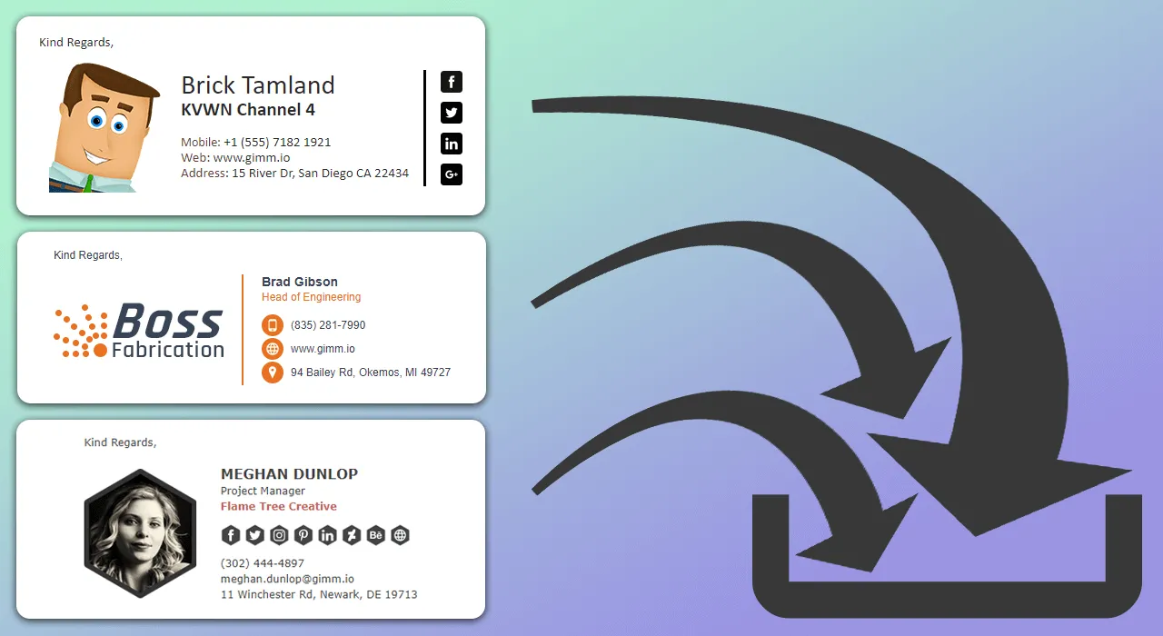
The saying “ First impression is your lasting impression” holds the profound truth because your first encounter is often your only chance to make a meaningful connection, be it online or face-to-face.
The connection between email signatures and first impressions is a lasting one that can potentially impact your company’s growth in the future. The impression I’m talking about is your email signature. Imagine you have a very important pitch to make as a salesperson through email and you sent the email with your personal email address and signature. Your credibility will fall dramatically if you do, and your hard work will go down the drain.
The perfect calligraphy signature design speaks a lot about your credibility. Here are some ways you can improve your email signature to make a lasting impression on your client.
Keep it simple
The first step is not to make it flashy but to keep it simple. You can consider changing your format to something flashy so it catches the reader’s eye, but a better approach is to keep it simple and elegant, as it is much easier to understand.
The key to a good business person is how they present themselves which means elegant and simple email signature design. Your name, title, company, and phone number are enough, and in some cases, your address. DON’T INCLUDE YOUR EMAIL ADDRESS! You’re already sending it through your email. So, adding your email address will seem redundant and unnecessary.
Use color
When I say use color, it does not mean you make it a unicorn and rainbow theme. It simply means try using 1 or 2 colors that are inspired by your brand logo or any other graphical elements you might use. If you end up using more than two colors, there is a chance that the colors may clash and become distracting from the real message.
So, the important thing to remember is that don’t make it too flashy. Try modesty and minimal color use which suits your brand style and logo. Stick to those colors throughout your email signature.
Limit your information
You must’ve gotten an email with loads of information in the email signature which might lead you astray of the real message. People tend to use extra information just so the client can reach out to them without any hassle. The real hassle is when people put their entire life story in their email signature.
Try to minimize the information provided so that the reader can concentrate on the important part of the email. Five lines of text, more or less, should be enough to describe yourself in the signature. Anything more than that can seem like stuffed information.
Add a photo
You can add more impact to your email signature if you decide to attach a photo along with it. The visual interest and imagery can draw a positive kind of attention. Some familiarity is appreciated by any and all clients. If they see a friendly face with a kind smile, they will be inclined to work with you rather than with a faceless person.
Everything has a purpose
While formatting, keeping your focus on the hierarchy of design in such a way in order to balance the content is even more crucial. Once we grasp this principle, the process that follows becomes simple. What goes first, and what comes at the end, how many divides are there, and all other factors contribute to an email signature. We have to capture their attention, though not directly. It should be emphasized that the first things to catch our eyes are bolded, boxed, or colored. Hence, make it a point that the most important details are embedded in this format.
Mention your company’s success
“Let me introduce you first. She’s a two-time Academy Award winner, Cate Blanchett,” is how big achievements of an actress are communicated informally while introducing her on the stage. In a similar way, email signatures work well for delivering information about your successes without braggadocio because it is possible to make such an expectation for the reader’s subconscious.
These include logos of, for example, some certified companies, or those who have completed certain courses establishing certain credibility over others. However, what is important to note is that it is other people perceiving those achievements and not you and you have to be moderately vocal about them. If you do achieve something, tell the world, but do not go overboard doing it.
Keep it mobile-friendly
When you format your email signature, make sure that it is mobile-friendly. What’s meant by this is to pick a design that can be easily viewed on anyone’s phone and isn’t just for computers and laptops. Most people access their emails through their phones and see the email signatures all out of order.
Make sure that you select the design that is supported on the phone as well and opt for small text so that they appear normal on a phone screen. Test your email signature a bunch of times to make sure you’re making no mistake.
Final thoughts
All of the matters discussed above matter in an email signature as it can create a lasting impression on the receiver. Try not to jam all of these ideas into one style, and keep a healthy balance of things. Remember, less is more. So, keep it simple and professional yet informative. Try to remember that less is more, and you should keep it simple and professional. But, at the same time, keep it informative. Remember the pointers given in this blog and become the master of email signatures.

